


A rant on web design
Let’s hope Nikon doesn’t switch over from its old lens page to this new-style, slow-to-load, and really annoying Nikon lens page, which doesn’t make it possible to direct-link to a specific lens.
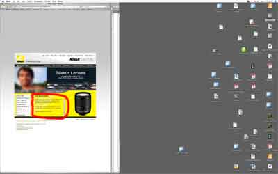
Instead you are greeted with useless animations and tiny type scrollable in a tiny area. Information of practical use is not provided, such as flare, distortion or MTF charts. Have fun reading the specifications in 8 point type confined to a 260 X 130 pixel area of the page. Idiotic best describes this type of web design. Shown below is my desktop (just the main screen—I have a 2nd monitor also). The area reserved for lens specifications is circled in red:
Does Nikon really think photographers all use 800 X 600 screens?